Last week we looked at the basics of auto layout, this week, we learn
- Diagonal Control Drag
- Using the layout error panel for misplaced layouts
- Introduce Size Classes
- Make a different layout for iPhone in portrait with Size Classes
Transcript
Hello, I’m Steve from MakeAppPie.com. In this video we are going to learn some more about Auto Layout and how to use Xcode’s new size classes feature. We’ll start with the completed project from the last video, so you might want to check that out first:
In the last project we made a universal app like this:
It works the same for iPhone and iPad. It also works the same for each device in both landscape and portrait. Size classes let us customize certain devices or orientations for a different layout than this generic layout.
If you click the width and height size class you will get a popup with a bunch of squares on it. This allows you to set the size class you want to work with.
There are three sizes for size classes: compact, any, and regular. Any is the generic size that works with anything. Our current layout, as we can see on the bottom the story board is width:any height:any. This layout is for all cases.
iPhones and the iPod touch are the compact size in both landscape and portrait, with one exception.
For both width and height, iPad is the regular size. The width in landscape is regular for an iPhone 6+.
In our application, we will change the location of the three buttons from above and below the text file to left side of the text field for the compact iPhones in landscape, and leave them the way they are in portrait. For the iPad and iPhone 6, we’ll move all three buttons to the top of the screen in our next video.
In the storyboard, click the width:any height:any button on the bottom of the storyboard. Move the square to any width, compact height for a iPhone in landscape.
Set up Xcode with the preview mode to have the phones in landscape so we can check them as we go through the steps. if you have the file browser open, you may want to close it to give yourself more room. Keep the document outline open.
To start let’s move the text view to the new location. Select the text view in the document outline. Select clear constraints in the constraints resolver. Drag the left handle so the view is less wide than the cheese button. We want to have a relationship to the pizza label, not the cheese button, so we can’t use the pin menu. Control drag from the text view to the label and release. select Vertical Spacing.
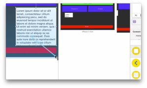
Since we will be moving the done button, we want a relationship with the bottom of the container, not the button. We also want a relationship with the right margin. We can do both at once with a diagonal drag. Control-drag from the text view to the bottom right corner. Xcode give us both trailing and bottom constraints. Shift click the Bottom space to container margin and Trailing space to container margin, then press return. Xcode adds both constraints.
As the warning indicates, we still have one more constraint to go, but we will get to that in a minute. Clear the constraints on the Cheese button. Move it under the pepperoni button.
Select pin and pin the cheese to the pepperoni 10 points away and the left margin 0 points away. Update the frames to the new constraints.
As you can see in the preview window, the buttons are now too small. Let’s fix the height first. Control drag from Cheese to Pepperoni and shift-select equal widths and equal heights. Remember pepperoni has an explicit width of 64, so that will make both 64 points high.
We get several layout error, but we can see in the preview that they are now the right width. Note on the preview that the text view has disappeared. That’s because we still didn’t set its width, which we’ll do as an equal width to the buttons, and have a space between them of 10 points.
Control drag from the pepperoni button to the text view. Shift select Horizontal spacing and equal widths, then press return. We get more errors. Click on the horizontal spacing constraint we just made, and in the inspector change the constant to 10 and press tab.
The preview shows we have the correct horizontal spacing but the storyboard shows errors. You’ll notice a small error indicator in the upper right corner of the inspector. If you click it, you will see your errors. All are misplaced views.
Select cheese on the storyboard, and click update frames for the selection. That fixes that.
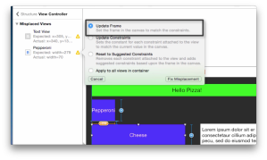
You can also resolve misplaced views in the error panel. Select the warning icon for pepperoni and a pop up lets you update the frame. Select Update Frame and click Fix Misplacement. Now pepperoni is correct.
Go back to the document outline and select the text view. Scroll to the constraints and change the top space to 10 points and the bottom space to 20. Select Text View in the outline and in the resolver Update selected frames
We need to lay out the done button next, which is now under the text view. In the outline, select the Done button. Clear its constraints.
In the done button. we won’t bleed off the edge this time. We will instead align it with the other buttons. Pin the done button to the left margin with 0 and the bottom to 20. Update the frame.
You can control drag from the outline too, for cases where you can’t see you frame. Control drag from the done button in the outline to the text view. select horizontal spacing. Now in the inspector change trailing space to text view to 10.
Lets set the size of the button. Control drag from the done button to the pepperoni button. Select equal widths and equal heights. We get a constraint error which is just a misplaced view. Click the icon and fix the misplacement.
We’ve completed the re-arrangement for the iPhone and iPod touch. In the preview, rotate the device, and you will see that it only arranges itself like this in landscape.
Go over to the iPad, and it ignores this.
The iPhone 6 plus is not happy though. This is okay for now, because in out next lesson, we are going to make a different layout for regular width any height layouts.


Leave a comment